
Facebook:
Mobile Email Design System Update

Background
Facebook for Business has been operating at full throttle since the beginning of the Covid-19 pandemic. In 2020, I joined Facebook’s Small Business Group, a team focusing on providing training and tools to small business owners around the world who use Facebook as a business tool.
At this point, Facebook had just updated their design system library, with assistance from Portland-based design agency INSTRUMENT. Though the design team now had a veritable library of modules and widgets to build fresh new webpages to our hearts content, I noticed we were still limited to the same tired email templates. Email is one of the main lines of communication between Facebook for Business and business owners (used by millions of users daily), so I took it upon myself to explore what our email system could look like.
Role
Visual + UX Designer
Media
Email Design system creation for Facebook for Business.
Role
Visual + UX Designer
Process

Current design:

Goals:
I’d designed countless email campaigns up to this point, so I was well versed in the design style, as well as the “must haves” of email design. My goals were twofold:
Keep the utility of the current design style to continue serving users the best email experience (scannable, legible, easy to digest).
Improve the aesthetic value and visual interest to the email experience.
Ideatation
User Journey flow:
Ideate
First round designs:

The current user journey is sparse: a page with one row of photos and a “Join Waitlist” CTA for each product. I imagined adding more opportunities for customers to achieve their goal of finding out more about the products, by providing them multiple ways to explore the products with options to see more product info, social images, reviews, and options to view similar products.
Design Exploration
Main page prototypes:

The winning layout for the main page featured a cascading layout with generous white space. The page invites users to explore each image, interact with the detail page and finally click the CTA.
Detail page prototypes:

The winning layout for the product page, was a clean, clear layout which includes space for more info, large photos, and the CTA to join the waitlist. This layout helps customers achieve their goal of learning more about each product, as well as accomplishing the company’s goal of driving customers toward the waitlist.
Desktop layout:
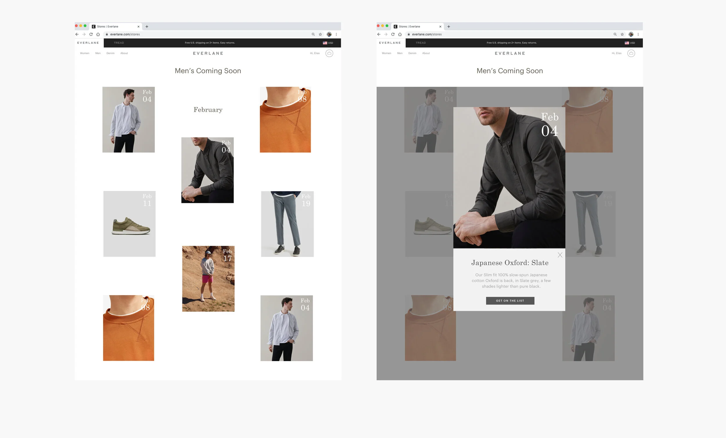
The desktop version expands the cascading layout to include more photos, but follows the same layout with ample white space that lets the styled shots speak for themselves, and offers flexibility in displaying different crops as needed. Extra info and the CTA are purposefully moved to a separate detail product page, one click away.
Since this page gets so much traffic and is a big revenue driver for the brand, I was also thinking about how the pages could be user tested to allow the best layout and features to bubble to the top. I don’t presume to know the best features to include, and I consider testing an important part of the iterative design process.
Desktop layout with sections for further user testing:

Final Design
My final designs allow customers to quickly skim through upcoming products, see a few photos, read brief product details, and join the waitlist.
Final Mobile Iteration:


Aside/ Note: