Product Design:
Everlane Web Page Refresh
About
Since it’s inception in 2010, Everlane has created a name for itself as a direct-to-consumer ethical clothing brand, building a loyal following by launching new products each week directly from its website.
As one of the only access points for customers to anticipate upcoming launches, the “coming soon” page is among the highest trafficked pages on Everlane.com. I saw the opportunity to improve user engagement on the page, so I challenged myself to reimagine how the page could be redesigned to increase user interaction by offering an experience more aligned with customer and company goals.
Role
UX Researcher + Designer
Media
Desktop and mobile pages for Everlane.com
Team
Felix Roos
Andrea Drake
Process
Insights
Before breaking ground, I met with internal stakeholders and key customer personas to gather information about the history of the page and ask about trends, ideas, and aspirations for it.
Once I had testable designs, I pressure tested some with external customers to understand their motivations and goals when navigating the page. I gathered the following.
From the customer perspective, the most valuable information on the page is seeing:
Styled photos (photoshoots with models)
Detail shots (closeups of fabric/materials)
Product info (fit, specs)
From Everlane’s perspective, the most important criteria were:
Mobile-first layout (a majority of page traffic)
A layout that does not require horizontal images, which were currently limiting photographers and stylists (see below)
Current design:
Defining Goals
Talking to the photo and design leads helped me define the two main goals for the coming soon page. They are:
Build hype for new products (customer-oriented)
Drive customers to the waitlist, which helps the merchandising team forecast appetite for product (company-oriented)
Ideate
User Journey flow:
The current user journey is sparse: a page with one row of photos and a “Join Waitlist” CTA for each product. I imagined adding more opportunities for customers to achieve their goal of finding out more about the products, by providing them multiple ways to explore the products with options to see more product info, social images, reviews, and options to view similar products.
Ideate
First round designs:
My initial designs included integrating a handful of features: social media, customer reviews, more info—my reasoning being that more information would translate to more opportunities to purchase. These ideas were reigned in after my first round of feedback, when I realized the designs were becoming too similar to the product purchase pages, which could confuse customers, and were misaligned with the goals for the page established earlier.
Prototype Exploration
Main page prototypes:
The winning layout for the main page featured a cascading layout with generous white space. The page invites users to explore each image, interact with the detail page and finally click the CTA.
Detail page prototypes:
The winning layout for the product page, was a clean, clear layout which includes space for more info, large photos, and the CTA to join the waitlist. This layout helps customers achieve their goal of learning more about each product, as well as accomplishing the company’s goal of driving customers toward the waitlist.
Desktop layout:
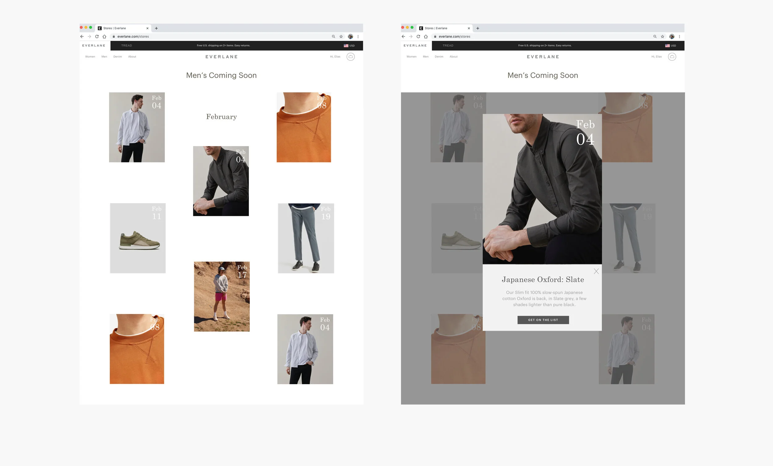
The desktop version expands the cascading layout to include more photos, but follows the same layout with ample white space that lets the styled shots speak for themselves, and offers flexibility in displaying different crops as needed. Extra info and the CTA are purposefully moved to a separate detail product page, one click away.
Since this page gets so much traffic and is a big revenue driver for the brand, I was also thinking about how the pages could be user tested to allow the best layout and features to bubble to the top. I don’t presume to know the best features to include, and I consider testing an important part of the iterative design process.
Desktop layout with sections for further user testing:
Final Design
My final designs allow customers to quickly skim through upcoming products, see a few photos, read brief product details, and join the waitlist.
Final Mobile Iteration:


